AI Contract Review — Triage & Trust
A timed take-home for a legal-AI startup: design how a lawyer acts on AI-flagged contract risk. The brief asked for one frame; the real question was where findings should live relative to the document, so I carried four competing layouts through the same three states and ended on what I would test first.
Overview
A timed take-home exercise for an early-stage legal-AI startup. The setup: a lawyer uploads a contract, the AI returns key clauses, risk flags, and suggested edits. Design how that comes back to them.
The brief asked for one low-fidelity frame. I produced fourteen.
Not to pad it. The interesting question was never what a single screen looks like. It was where the findings live relative to the document, and that is not answerable without putting the alternatives next to each other. So the real work here is a product decision — how a lawyer should act on AI-flagged risk — carried through four competing layouts instead of argued in the abstract. (How I produced fourteen frames inside a timed exercise is at the bottom of the page.)
The Problem
A two-to-five page NDA comes back with roughly forty findings. Show all forty and you have replaced reading the contract with reading a list the same length. Show too few and the lawyer stops trusting that the system caught anything.
The user is a lawyer under billable-hour pressure. They will not learn a new tool. Whatever this is has to feel like something they already know, and it has to let them understand the contract’s state in about ten seconds.
Design Principles
Hide the document behind a triage layer. Three finding types, each pinned to a location in the contract, nothing more. The raw text is available but it is not the entry point.
Risks lead, clauses orient, edits are the action layer. Risks are what gets a lawyer fired. Clauses are context. Edits are housekeeping. Every layout enforces that order, and I treated it as a rule rather than a preference.
Accept / Reject / Edit / Skip is the hero interaction. Track Changes is the mental model lawyers already have. Mapping onto it means the core loop needs no explanation. Each suggestion carries a one-to-two sentence rationale from the system, so trust is earned at the moment of decision rather than promised in a settings screen.
Show the work on confidentiality. “Processed on-device. No third-party LLM calls.” A lawyer pasting a client contract into an AI tool has a specific fear, and the interface should answer it before being asked.
Four Directions, Not One
The spatial question is genuinely open, so I explored four and annotated the tradeoff on each rather than picking early and defending it.
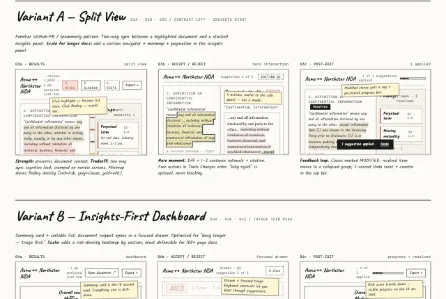
- A — Split View. Document left, stacked insights right, two-way sync. Familiar GitHub-PR pattern. Preserves context, but crowded on narrow screens.
- B — Insights-First Dashboard. Summary card with a drill-down drawer. Fastest triage. Risks the lawyer trusting a summary without reading the source.
- C — Document-First. Full-width contract with margin comments, the way lawyers already read. Slowest to triage.
- D — Tabbed. Risks / Clauses / Edits, one type at a time. Forces prioritization, but fragments the relationship between a risk and its fix.
Each direction runs through the same three states: results, the accept/reject moment, and the post-edit feedback loop. Comparing them at the same state is the only way the tradeoffs become legible.
What I Would Test First
The exercise ends on open questions rather than a recommendation, because the recommendation depends on answers I did not have:
- Do lawyers trust an AI summary enough to triage from it, or do they always need the source first? This decides whether B or C is the primary pattern.
- Is Track Changes the right mental model for AI-suggested edits, or does Accept/Reject/Edit/Skip feel too much like “editor” and not enough like “reviewer”?
- Where does the risk hierarchy break down? Is a missing clause always more urgent than unusual language, or is that matter-dependent?
The Wireframes
Fourteen frames in a hand-drawn visual style, annotated throughout. Grayscale, with three accent colors doing all the semantic work: risk, key clause, suggested edit.
The embed below stacks to a single column. Open it in its own tab to see each variant’s three states side by side, which is how the comparison is meant to be read.
Open the full wireframe set in a new tab →
How This Was Made
Designed and produced in Claude Design. The wireframe document is a single self-contained HTML file, AI-generated under my direction.
That is the part worth saying out loud. Working this way, I iterate on a layout variant at the speed of describing it, and one visual legend stays consistent across fourteen frames without anyone maintaining a component library for a throwaway artifact. Four directions explored instead of one defended, inside the same time budget.
The decisions on this page are mine: what to hide, what leads, which interaction carries the trust. The production was AI, and being fast at directing it is now part of the craft rather than a shortcut around it.
Client branding has been genericized. No design decision was changed.