Sense Engine
Real-Time Location System
Supervisors had 200 tagged devices across three vendors and no way to answer "where is it?" I gathered the requirements, designed the workflows and the operator interface, and directed an AI-assisted build that went live across a 50,000 sq ft facility in under six months.
Sense Engine tracked the 200 Bluetooth devices in a single deployment at a 50,000 sq ft FMS facility. The same building also ran 37 devices on LoRaWAN — 25 professional sensors plus 12 THPO units I designed and built. See the commissioning story.
Design & Deployment
Multi-vendor API
50,000 sq ft
(Claude + Cursor)
The short version
- Problem
- A facility had 200 Bluetooth tags on assets, vehicles and personnel across 50,000 sq ft, read by gateways from three vendors (Cisco Spaces, Meraki, Moko). Each spoke a different protocol. There was no floor plan, no zones, no alerts, and no way to answer the one question people on the floor had: where is it, and where did it go?
- What I learned
- Warehouse staff needed a zone and an aisle, not a coordinate. Positioning landed around 5 meters, which answers exactly that. RSSI values, MAC addresses and a choice between five positioning methods were information they could not act on and were never going to learn. And three different people would open the same screen: an engineer debugging, someone demoing to a stranger, and an associate looking for a thing while walking.
- Decision
- Hide five positioning methods behind one dot on a floor plan. The system picks and labels the method per device; technical users can override it and open the raw payload. Supervisors draw zones and set alerts themselves, and a floor plan is aligned by matching three pins instead of dragging and rotating an image. Rejected: putting method choice and signal data in the main view, and the original drag-to-align floor plan tool.
- Result
- Deployed across the 50,000 sq ft facility, tracking 200 devices from three vendor streams in one map view, from zero to deployed in under six months. Deciding the system should ignore rotating phone MACs made the map usable and stable. Adding a vendor became a configuration change. The proof of concept ended before warehouse staff used it, so the associate view is still untested by the people it was designed for.
- How I validated it
- There was no budget for usability sessions, so I walked every workflow as each of the three users against live device data, in a directed AI-assisted build (Claude and Cursor) running in the field.
Users
Three people open this screen.
They want completely different things from it.
There was no budget and no access for formal usability sessions — this was a proof-of-concept at a live facility, not a funded research program. What I did instead was define the three people who would actually open this interface, and walk every workflow through it as each of them in turn, repeatedly, against live device data.
That is a weaker instrument than watching real users, and I want to be straightforward that it is. It was strong enough to do the one thing that mattered: it kept surfacing places where a decision that was obviously correct for one of them was quietly unusable for another.
"Is the device broken, or is my math wrong?"
Commissioning and debugging. When a dot sits in the wrong aisle, this person has to separate a failing sensor from a bad gateway from a positioning method that is simply the wrong choice for that floor plan. A clean map actively hides the evidence they need.
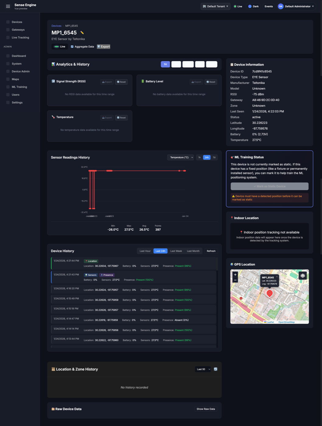
What they got: a raw payload window — the actual packet as it arrived, before any normalization — alongside the positioning method and signal confidence for the selected device.
"Make a stranger understand this in four minutes."
Usually me, in a room with a prospective client who has never seen an RTLS before, on someone else's screen and someone else's network. A static map of correctly placed dots proves nothing to this audience — it looks like a picture.
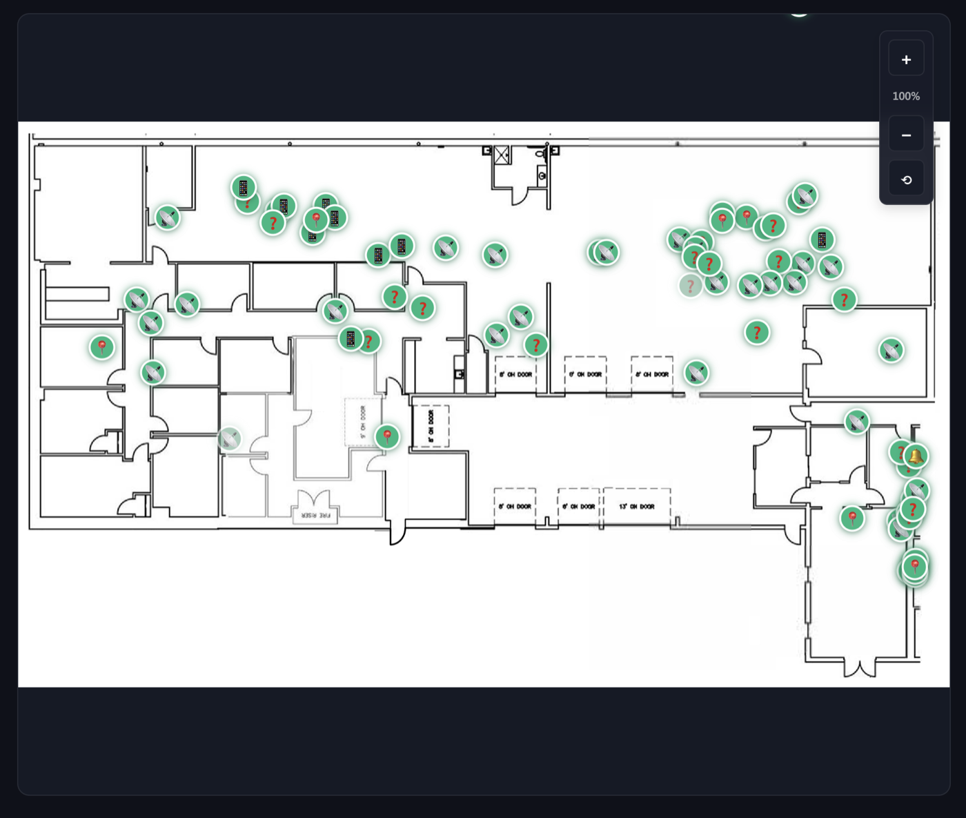
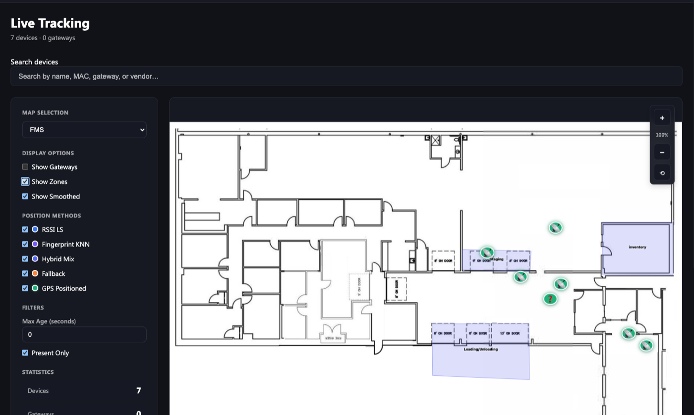
What they got: devices that visibly move between zones so you can follow one with your eye, a consistent design system so the screen reads as a product rather than a test harness, and visual settings that let a demo be configured for a specific room in minutes.
"Where is it, and where did it go?"
Locating product and stock, following it from one zone to the next, and catching loss and theft — an item leaving a zone it should never leave. This person is not troubleshooting the system. They are looking for a thing, usually while walking.
What they got: a dot, a zone, and a history of which zones it passed through. RSSI values, MAC addresses, KNN confidence and the choice between five positioning methods are all deliberately absent — every one of those is information this person cannot act on.
The engineer needs the raw packet. The associate needs it gone. The demo-er needs the screen to be legible to someone who has never seen it. Those three pull in different directions, and almost every interface decision in this project is a resolution of that tension.
Iteration
Two things I got wrong the first time.
I asked the user to do a spatial task by hand. They shouldn't have had to.
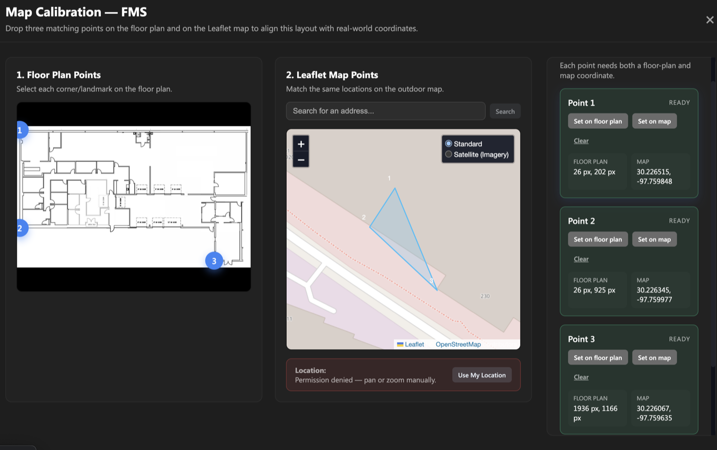
Upload a floor plan image, then drag, resize and rotate it over the map until it lines up. Fine for me, because I knew what "lined up" meant. Tedious and genuinely difficult for anyone else, and the result was only ever as square as your patience.
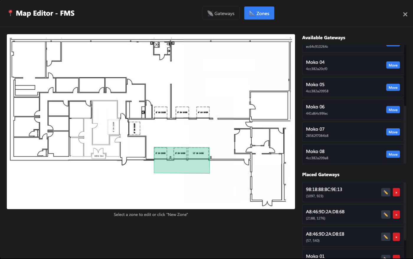
Drop a pin on a recognizable point in the uploaded floor plan, then drop the matching pin on the GPS map. Repeat for a second and third point. The system solves the alignment. You are no longer doing a transform by hand — you are answering "this corner is that corner," which is a question anybody can answer.
The part I didn't see coming: because every floor plan now had real latitude and longitude underneath it, indoor positions and outdoor GPS positions became the same kind of thing. Any device reporting GPS could appear on the same map as the BLE devices, with no special handling — as long as its data reached the MQTT broker, Sense Engine could place it. A usability fix opened up outdoor tracking as a capability. I would like to claim I planned that.
A crash that turned out to be a scope question.
The system would run for days and then fall over. I spent a long time treating it as a memory leak to hunt, because that is what it looked like from the engineer's seat.
Consumer BLE devices rotate their MAC address on a timer for privacy. Every phone, watch and earbud that walked through the building was arriving as a brand new device every few minutes, and the system was dutifully tracking each one forever. It was not leaking memory so much as diligently remembering an unbounded number of ghosts.
Filtering to static MACs — tracked assets only — flattened the growth curve. But the reason it is in this section rather than the engineering one is that the fix was a product decision wearing an engineering costume. The associate was never going to locate a pallet on a map crowded with a hundred strangers' phones. Deciding what the system had no business tracking made the map usable and made it stable, in that order.
Edge Case: The Panic Button
Someone presses a button.
You have twenty seconds.
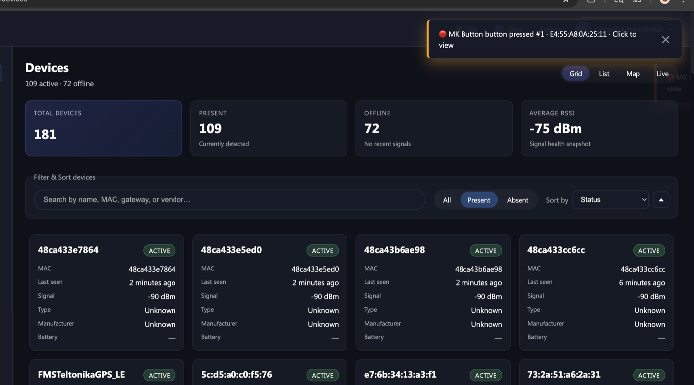
Some of the devices in the deployment weren't assets being tracked. They were button cards a person carries and presses when something is wrong. That changes the product completely. A location update that arrives thirty seconds late is a minor annoyance. A call for help that arrives thirty seconds late is a different kind of failure, and the requirement we held ourselves to was under twenty seconds from press to something visible on screen.
The first design was working against that. Everything moved through a batched compile cycle — reasonable for hundreds of devices reporting position, since batching is exactly what kept the volume manageable. But it meant a button press waited its turn behind traffic that didn't matter, and under load the wait was the whole budget.
So button presses got their own path. The aggregator watches for the press itself — an alarm status flipping, or a trigger count stepping up — and when it sees one, it skips the queue entirely and compiles that single device immediately, then pushes it straight out over the socket. One device, right now, ahead of everything else. A ten-second cooldown keeps the repeat packets that follow a press from firing the same alert four times.
Press detection lives in one place on the backend. The frontend never guesses — it only displays what it's told.
That one device compiles immediately instead of waiting for the next batch.
The device jumps to the top of the list, pulses on the map, and the toast stays until a person dismisses it.
That last part is the design half, and it's the half I'd defend hardest. Getting the event to the browser in under twenty seconds is worth nothing if it lands as one more notification in a row of notifications. An alert a supervisor can dismiss by accident hasn't been delivered — so this one doesn't auto-dismiss, doesn't sort by time, and doesn't look like anything else on the screen.
Platform
What it looks like.
Behind the Dot
What had to exist so the associate
could see one dot.
Every layer under the map exists to answer a requirement from one of the three people above. I defined what each layer had to do and why; the build itself was AI-assisted.
One boring model for three vendors
Cisco Spaces, Meraki and Moko each describe the same event differently. Early versions of the shared model were shaped around whichever vendor was in front of me that week and broke on the next one. What worked was giving up on one clever universal shape: each vendor gets a translator whose only job is to produce a deliberately boring common reading. Once nothing downstream knew where a reading came from, adding a vendor touched only its translator.
The system picks the positioning method
Five positioning methods sit behind the map, and the system chooses and labels one per device; the engineer can override it. Positioning ran on signal strength only, landing around 5 meters, which answers "which zone, which aisle." For floors where that was not enough, a training mode lets someone walk the floor and record reference points without leaving the interface.
Floor plans, zones and alerts in the interface
Floor plans align by matching three pins, zones are drawn directly on the plan, and alerts fire when a device enters, exits or goes offline. Designed so a shift supervisor could configure it without reading documentation.
Hardware and customers as configuration
After the deployment, the question became how many. New hardware is onboarded through a declarative device profile rather than new parsing code, and every customer is walled off by design at each layer, so the safe path is also the default path. Adding a vendor became a configuration change.
Process
How I worked.
I came into this with no RTLS background. The build methodology was deliberately AI-native — not as a shortcut, but as a way to compress the learning curve and move from unknowns to working software faster.
Start in Claude, understand the domain
Before any code was generated, I used Claude to develop a working understanding of BLE positioning, fingerprinting, and the specific vendor APIs. This compressed weeks of documentation reading into targeted, testable knowledge.
Scaffold in Cursor, iterate with real data
The pipeline was scaffolded in Cursor with AI in the loop for the vendor-specific payload decoding. Real device data from the field caught edge cases fast. Every build was tested against live data from day one, not mocks.
UX built alongside the data model
The interface was designed as the data model stabilized — not after. Decisions about what to normalize, what to store, and what to surface were driven by what the operator actually needed to see. Design and engineering decisions were inseparable throughout.
Deployed and tested in the field
The sensor network — BLE gateways, Teltonika EYE sensors, LoRaWAN infrastructure on Helium and The Things Network — was deployed across a real facility. I ran the workflows against live field data as each of the three user types rather than in a lab — real gateways, real interference, real device drop-offs. That is what forced the hard UX decisions.
Outcome
What it produced.
Adding a vendor stopped being an engineering project
Before the normalization layer, every new device vendor meant custom work wired into the deployment. Once decoding was separated from device profiles, onboarding a vendor became a configuration change instead. I didn't instrument this, so I won't put a number on it — but it changed what the job was.
Designed for an operator who never got to use it
The proof-of-concept ended before warehouse staff were ever put in front of the system, so the associate-facing design is untested by the people it was built for. I am listing it as an outcome anyway, because the constraint it created was real: every decision about that view had to be defensible without the safety net of watching someone use it. The next version of this work starts by putting it in their hands.
Still generating client interest
The PoC wrapped, but the platform didn't. It continues to be actively evaluated and demoed. For a system taken from zero to deployed in under six months, in a domain I'd never worked in, by one person directing AI — that's the result that matters.
Tech stack
Validated through an AI-assisted build I directed (Claude and Cursor), deployed across a 50,000 sq ft facility. I set the requirements and designed the workflows; the AI wrote the code.