Mission Control
Agentic Developer Portal
A full-cycle design challenge — from six divergent mental models to a production-grade React prototype suitable for moderated user testing and developer handoff.
& Engineer
directions + prototype
Tailwind · shadcn

Mission Control — fleet view. 12 repos, health signals, live agent indicators, and batch operations at a glance.
The Brief
Design and prototype
a slice of an AI-native developer portal.
The prompt: a Platform/DevEx engineer overseeing a fleet of services needs to pick a repo, view its health signals, trigger an AI agent task, watch it run in real time, and review the output. End to end. At scale.
The challenge wasn't just to wireframe a flow — it was to explore the design space before committing to a direction. That meant starting wide: generating six distinct mental models for the same problem, evaluating the bet each one makes, and then converging on the strongest synthesis with enough depth to be production-ready.
Who I designed for
Platform/DevEx engineers work at a fundamentally different scale.
100+ services to keep healthy
Their job is triage and delegation at scale, not depth in any single repo. Information density beats whitespace — they want to see many repos and many running agents at once.
Trust mechanics matter
Agents touch shared infrastructure. Approve, edit, interrupt must be first-class controls — not buried in settings. The same agent action might need different supervision in different contexts.
Keyboard speed matters
They live in terminals. The portal must feel as fast as a CLI — ⌘K for any action, keyboard navigation, no modal-heavy flows that slow down power users.
Method — Six directions in parallel
Diverge before converging.
Six mental models. Same 6-step flow.
Instead of polishing one idea early, I deliberately sampled a wide design space. Each direction takes the same end-to-end flow — pick repo → insights → trigger → live → results → history — and re-frames it around a different mental model for a Platform engineer. Reading left-to-right inside one direction shows the flow; reading top-to-bottom across directions shows the bet.
In a real cycle I'd put these in front of 5–8 platform engineers for ~15 minute unmoderated think-alouds, then merge the strongest signals. For this challenge I picked the direction that mapped most cleanly to the workflows I observed in research.

Mission Control
Bet: Density, transparency, and fleet-first navigation give power users everything they need without hiding context.
Risk: Density can overwhelm newcomers; the first screen is a lot.
Open prototype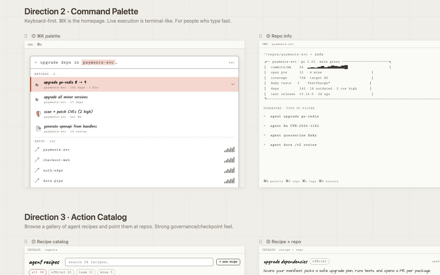
Command Palette
Bet: The fastest interface is no interface: one keyboard shortcut surfaces any action, any repo, any run.
Risk: Discoverability suffers for keyboard-shy users; there's nothing to browse.
Open prototype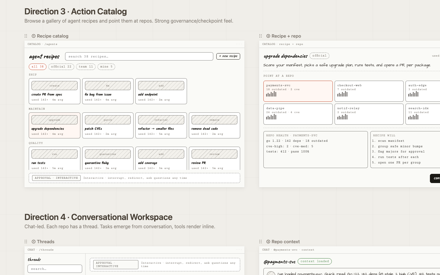
Action Catalog
Bet: Pre-built, named actions lower the barrier to entry and make agents feel trustworthy and intentional.
Risk: Over-templating; the recipe list becomes a maintenance burden as capabilities grow.
Open prototype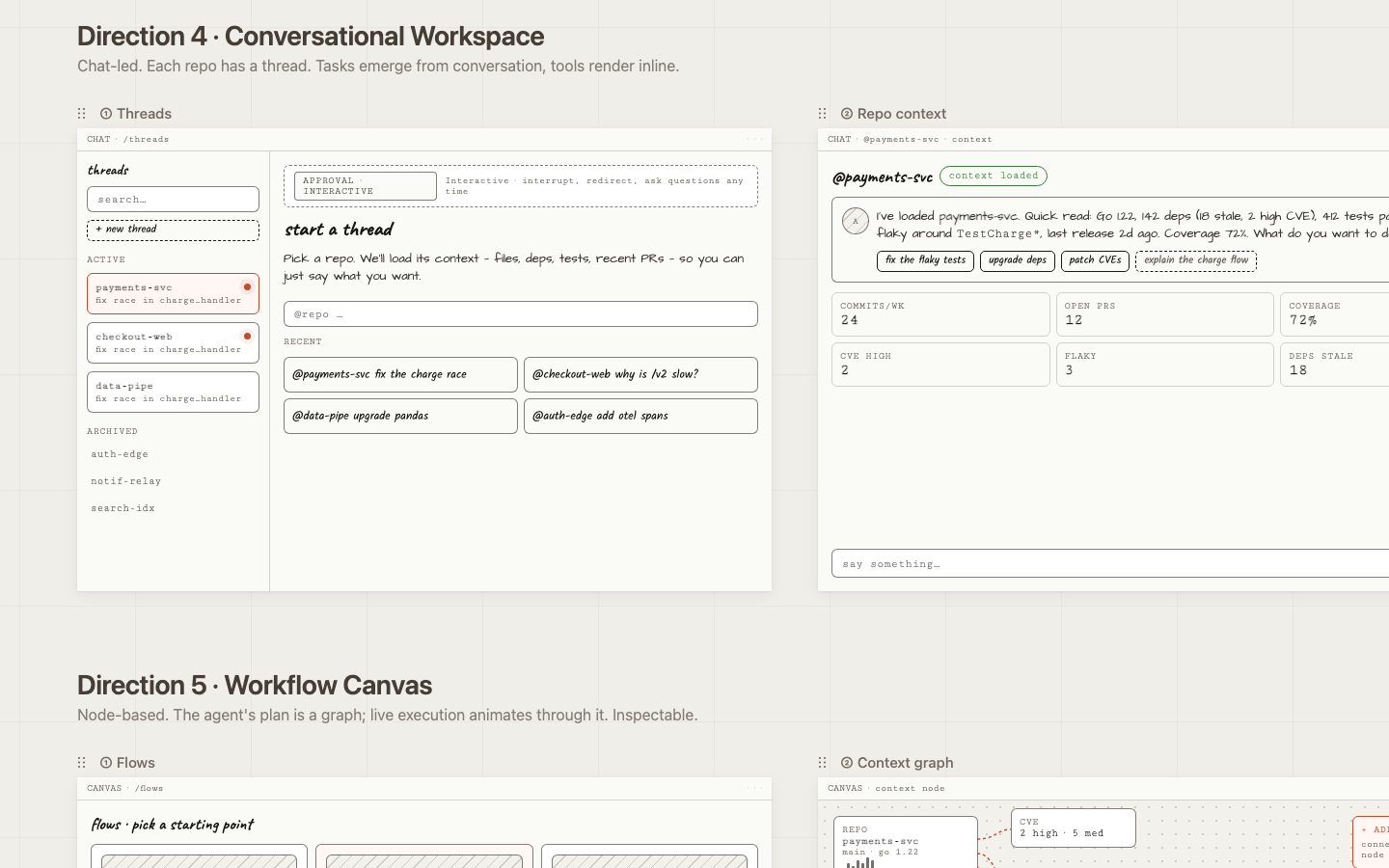
Conversational Workspace
Bet: A narrated, chat-based interface is the easiest mental model for cross-functional users reviewing agent work.
Risk: Hard to scan many threads at once; weak for fleet-level patterns.
Open prototype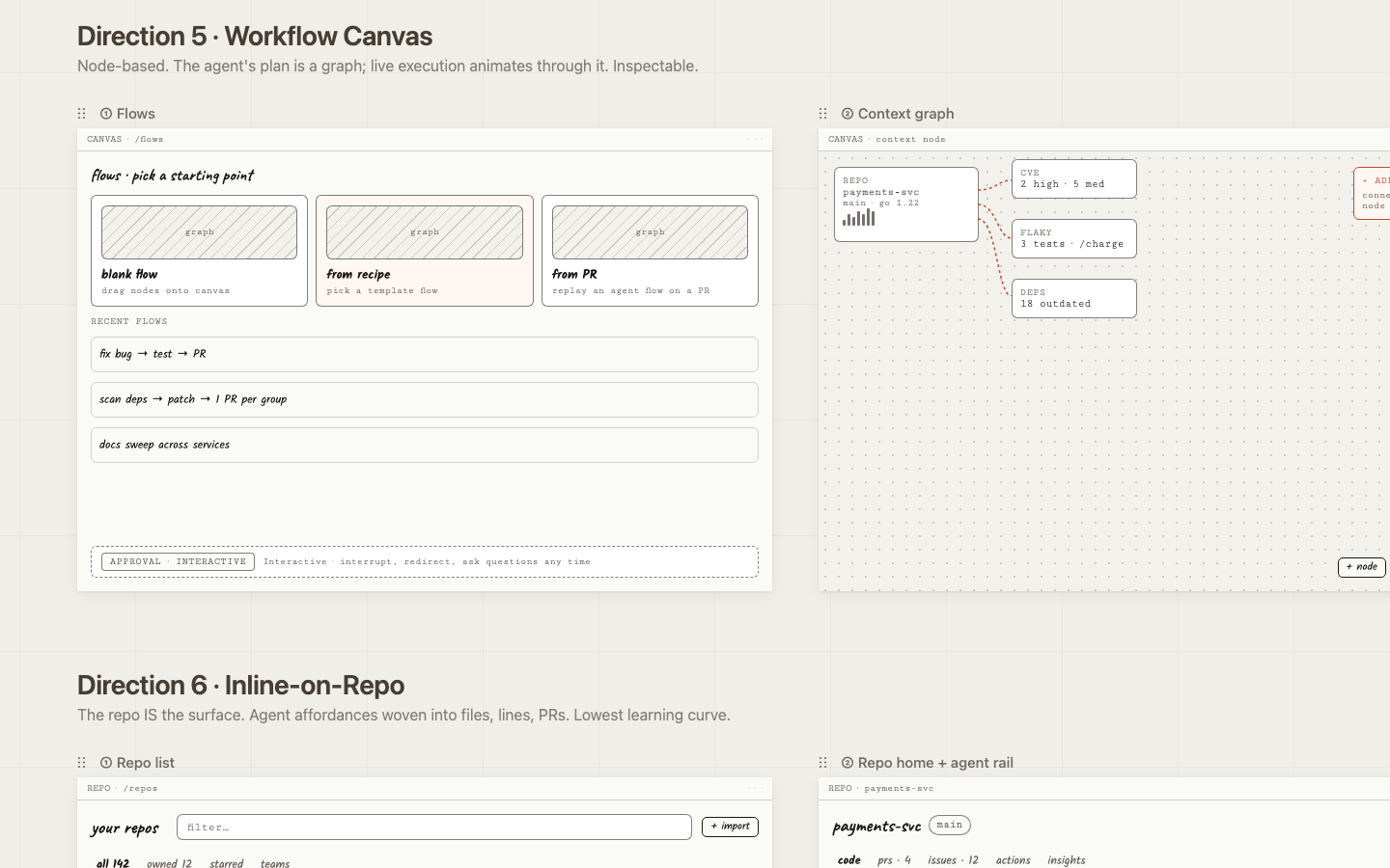
Workflow Canvas
Bet: Visualizing branching agent plans gives engineers the mental model they already use for CI/CD pipelines.
Risk: High learning curve; visually heavy for simple linear tasks.
Open prototype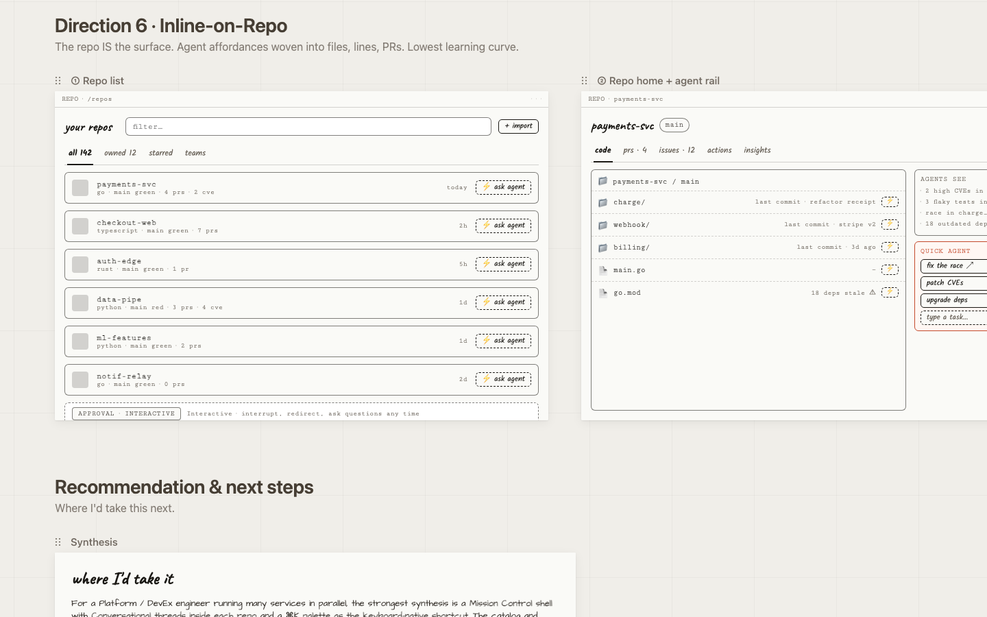
Inline on Repo
Bet: Zero context switch: trigger, watch, and review agents without leaving the files you're already looking at.
Risk: Requires hosting the entire code-host UI; scope grows quickly.
Open prototypeCross-cutting decisions
Five choices that apply
to every direction.
Some design decisions aren't specific to one direction — they're load-bearing across all six because they're where the trust and clarity work actually lives. Getting these right matters more than which shell you put them in.
One reserved color for "agent is live"
Every direction uses a single warm accent for active agent surfaces — running traces, streaming nodes, agent-authored PRs. Everything else is grayscale. The eye learns in seconds: orange means something is happening right now. Status is encoded in a small set of chips (idle / queued / running / paused / waiting / done / failed) that appear identically everywhere.
Approval model is a top-level mode, not a buried setting
The portal exposes four modes — fire-and-forget, plan-first, checkpoints, interactive. Toggling it changes the live-execution screens across all directions. At this user's scale, the same agent action might need different supervision in different contexts: a CVE patch on a critical service vs. a docs sweep on a side project. Each live-execution screen carries a small mode banner so the user is never surprised by how autonomous the agent is.
"Three of the six directions deliberately try different visual vocabularies for 'watch the agent work': step cards, terminal stream, inline tool-call thread, animating graph, and inline diff stream. This is the most user-test-worthy axis — engineers genuinely disagree about what 'transparent' should look like."
— writeup.md §3.3
Interrupt is a primary control everywhere
Every live screen has a persistent input for redirecting the agent mid-run, a pause button, a stop button, and feedback that the interrupt was received before the next step starts. This is non-negotiable for a Platform engineer overseeing fleets — the cost of a mis-aimed agent run is real.
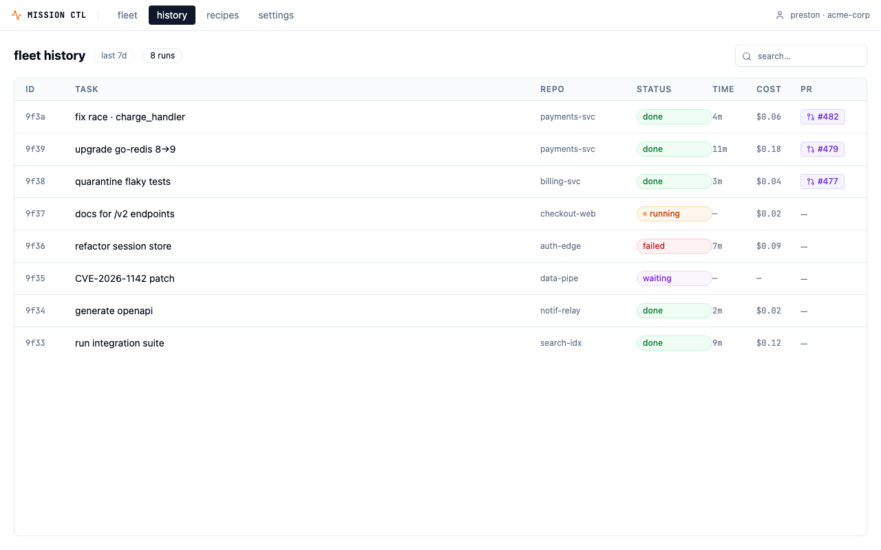
History is a fleet object, not a per-repo log
Every direction's history view is grouped to make patterns visible — which agents waste tokens, which repos eat the most retries, which recipes drift toward yellow. This is where DevEx engineers will spend more time than they expect: the cross-repo signal is the product's long-term value.
Convergence
Why Direction 1.
Three pieces of evidence converged on Mission Control as the direction to take to high-fidelity.
It mirrors the dominant developer mental model
Devs already live in CLI/terminal/agent-runner UIs — Claude Code, Cursor agent, GitHub Actions, Vercel deploy logs. Reusing that vocabulary (run id, trace, tokens, cost, status: running/done/failed) means zero learning curve.
Transparency is the core feature, not a sidebar
That maps directly to the #1 complaint about Claude Code: the agent's work is hidden behind a spinner, and when something goes wrong you can't tell what it did. Trust scales with visibility — especially when you're delegating to 142 repos at once.
It composes with the others
The Inbox, Recipe, and Map directions can all live as views inside Mission Control. Picking #1 doesn't kill the others — it makes them tabs and screens within a coherent shell.
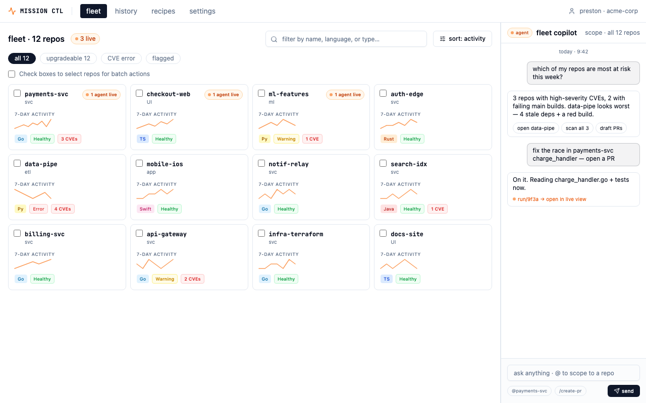
The deployed prototype — fleet view with health signals, activity sparklines, and multi-select batch operations.
Five design decisions
The load-bearing choices.
These are the decisions that shaped the shipped prototype. Each has a why that goes deeper than aesthetics.
Wizard-of-Oz accordion in the live trace
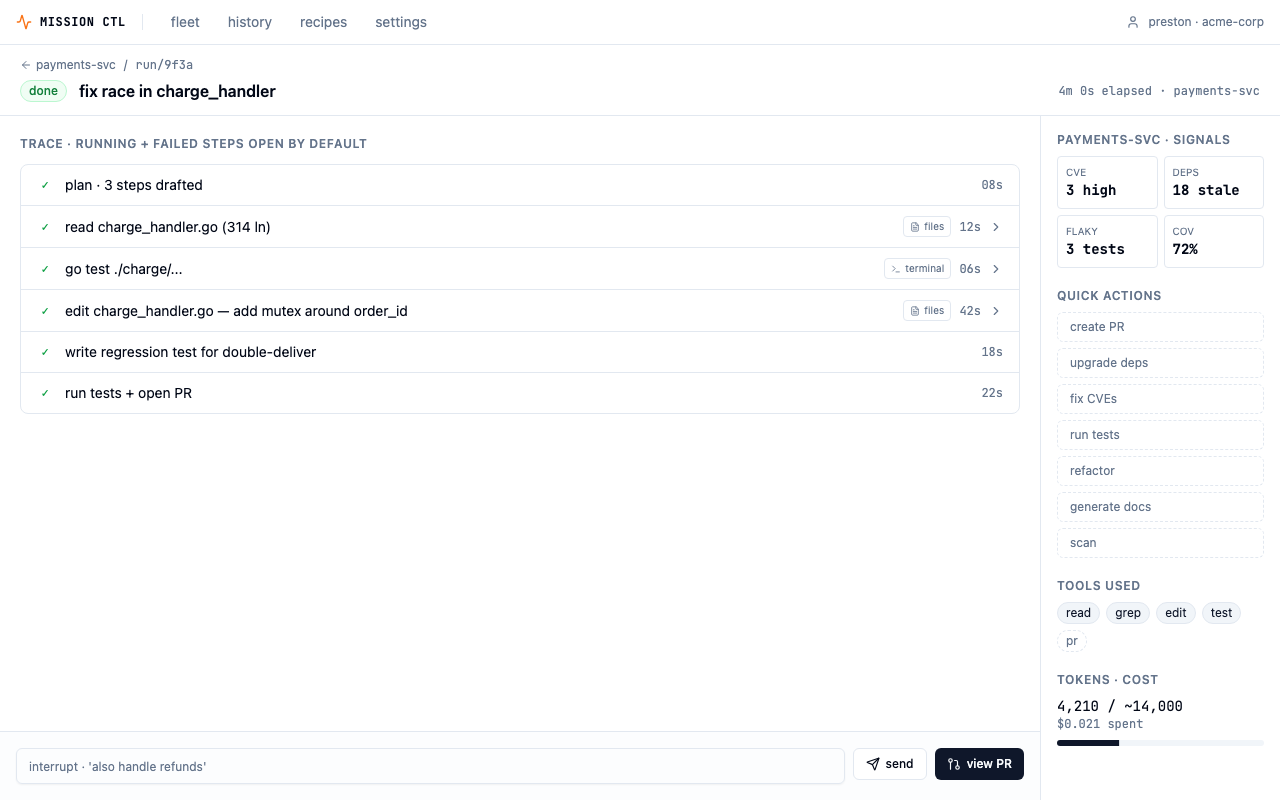
Each step in the agent's trace is collapsible. The running step expands by default; successful steps collapse; failed steps stay expanded. This is progressive disclosure — surface confidence by default (✓ done · 12s), reveal proof on demand. The single biggest gripe from devs using agentic tools is opacity: "What is it actually doing right now?" The accordion answers that without overwhelming the screen on every run.
"GitHub Actions, Vercel, CircleCI, and Linear's agent UI all use the same expand-step-to-see-logs pattern. It's the de-facto standard in the CI/CD space, which is the closest analog to "watching an agent work.""
Tabbed, action-first repo screen
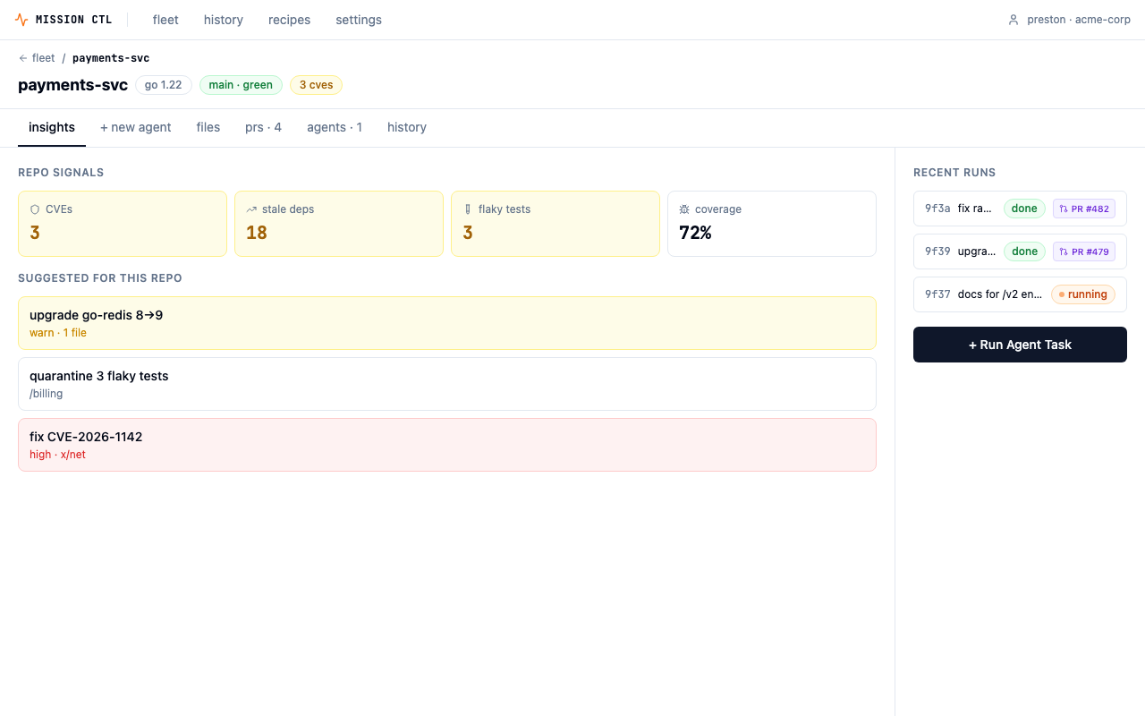
The tab order is insights → + new agent → files → prs → agents → history. Insights is the default landing tab. The earlier flow had users leaving the insights view to compose a run on a separate screen — a lossy handoff where the why (signals) and the what (the prompt being written) lived on different pages. With tabs, context co-locates with the trigger. Clicking a suggested run pre-populates the new-agent tab.
"It collapses a step. Insights → Trigger was a 2-screen flow. With the tab, it's one screen with a toggle."
2-column composer/context layout
Inside the new-agent tab, the left column holds the action picker, prompt, scope/guardrails, and launch bar. The right rail holds suggested runs, repo signals, and recent runs. Reading order matches task flow: pick an action → write a prompt → set guardrails → launch. The right rail is reference material, not workflow — splitting "do" from "know" reduces visual noise on the primary path while keeping signals one glance away.
"The launch bar sits in its own bordered tray at the bottom-left so it reads as a terminal "submit" affordance — familiar vocabulary for an engineer who lives in the CLI."
PR review modeled on GitHub
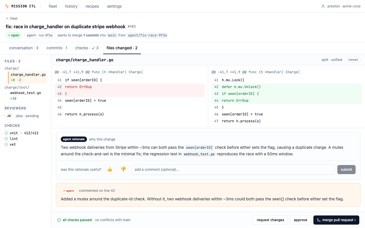
The agent's output isn't a custom "agent results" screen — it's a familiar GitHub PR page. Using a different UI for agent PRs vs. human PRs would create a two-class system and make agent output feel less trustworthy. A dedicated agent rationale panel sits inline with the diff, with a thumbs/comment feedback widget that collapses to a summary line after submission — signal captured, review area stays clean.
"The agent commits to a branch, opens a PR, gets reviewed, and merges through the same gates as anyone else. That framing is the entire trust story for the product."
App-level nav as a fleet-level pairing
A persistent top nav — fleet · history · recipes · settings — sits above fleet-level screens. History is cross-repo telemetry at the same scope as the picker; they belong in the same chrome. Repo-level screens (live, PR review, new agent) are deeper contexts and inherit the nav implicitly. Two entry points to history: top nav for deliberate navigation, and a "history ↗" link in the fleet view for "what just ran?" moments.
"The chrome doubles as branding. MISSION CTL wordmark + org chip is the product's persistent shell — it tells the user what app they're in when this eventually lives alongside Claude Code, Cursor, and other agentic tools."
Built for handoff
Most design challenges stop at Figma.
This one shipped in production-grade React.
The prototype isn't a demo reel — it's a working application deployed to production, built to the standard you'd hand off to an engineering team. Every route, interaction, and state is implemented.
Live prototype — interact directly:
Demo
3-minute walkthrough.
Fleet overview → repo insights → agent composer → live trace → PR review → fleet history.
What I'd do next
Five validation steps before committing to a direction.
The prototype is a strong starting point — but it's still a hypothesis. Here's what I'd test before treating any of these decisions as settled.
Test the real-time treatments
Show 3–4 platform engineers the four live-execution variants (step cards / terminal stream / conversational thread / animating graph) and watch which they trust under stress. This is the most user-test-worthy axis — engineers genuinely disagree about what "transparent" should look like.
Define the agent capability model
Settle the trigger contract — action, scope, guardrails, approval policy — so the trigger UI in any direction stays consistent. Right now the prompt field is a free-form text box; that works for power users but will confuse newcomers.
Push directions 1 + 4 to hi-fi
Prototype the interrupt/redirect interaction at depth. That's where this product lives or dies — the cost of a mis-aimed agent run is real, and the "pause and redirect" affordance needs to feel fast and trustworthy under pressure.
Decide approval-mode defaults per action
CVE patches and major-version bumps default to plan-first; docs and test quarantine default to fire-and-forget. Make these org-overridable. The UI needs to communicate the active policy clearly at all times — a small mode banner in the live trace isn't enough if users can't easily change it.
Stress-test density at 100+ repos
The 12-repo fleet grid is a starting point. A real Platform team has 100+ services. That means faceted filters, saved views, starred repos, and probably a different default grouping — by team, by health status, by recent activity. The card design will need to adapt.
Apple Design Challenge · May 2026
Back to projects